Theater Mode first impressions

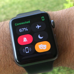
The headline feature in WatchOS 3.2 is Theater Mode. It’s turned on and off with a button in control center. Theater Mode consists of one thing: the watch face won’t turn on on wrist raise — you need to tap the screen (or press the digital crown). A decent solution to an obvious problem, but one that raises a few questions:

  • Why is this called Theater Mode? If only 10% of Apple Watch users sleep with their watches on (as I do), this will be used for sleeping a hundred times as often as it’s used at the theater.
  • Why can’t this be activated on a timer like Do Not Disturb? (Hell, why not combine it with Do Not Disturb?)
  • Drama masks, seriously?

To me though the biggest question is, if control center is going to scroll, what about all the other things that could/should be in there? For starters, how about a brightness slider? I have my watch permanently set to the dimmest setting because of how bright it is indoors after dark and because of how buried in settings the brightness adjustment is. Until the watch gets a much-needed hardware light level sensor, wouldn’t a brightness setting be a natural thing to have in control center? (And seriously, control center should be user-configurable. I never ever use the mute (always on), Do Not Disturb (on a timer, synced with my phone), or airplane mode (also better activated from the phone) buttons, but I would use volume and brightness sliders every single day.

 

Yet another activity achievement

Hoo boy, here we go again. Apple is touting another Activity achievement for January: close all three activity rings every day in one of the four weeks in January and you get a special activity award. Considering how well the last one of these worked out I’m not going to be bending over backwards. Pretty ballsy of Apple to be putting this out without ever having fixed the Thanksgiving thing, eh?

Un-pairing and re-pairing Apple Watch

While trying to troubleshoot the Thanksgiving activity fail I contacted Apple support and they suggested un-pairing and re-pairing the apple watch. This did not fix the problem, and the support person on the online chat at that point didn’t have any more ideas and wanted to set up an “RTA” (request for technical assistance) phone call. That’s way more effort than I’m willing to go through to try to figure this out.

Meanwhile, un-pairing and re-pairing is no fun. It takes forever, and I’ve had a number of problems since then.

  • Streaks stopped syncing to the watch. Now it shows a phone icon and says “Add a task to begin.” I tried to uninstall/reinstall it from the watch, which didn’t help. I bet uninstall/reinstall on the phone would fix it, but then I’d have to recreate all my tasks and schedules. (Update: This corrected itself after two days.)
  • Contrary to Apple’s documentation, my app layout was not preserved. Thumbs down.
  • Also worth mentioning that this process takes a long time. That’s because when you un-pair the entire watch is backed up to the phone.

Thanksgiving activity achievement

img_6159Dust off your running shoes: on turkey day only, your Activity app has a special award if you run 3.1 miles (5k).
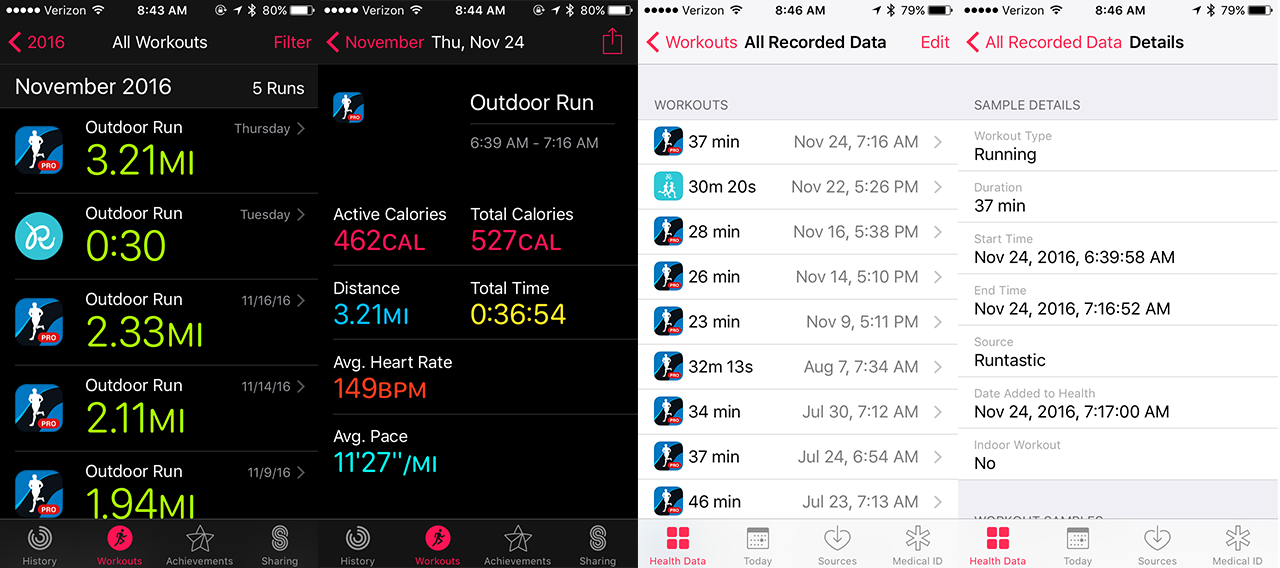
Earn this special achievement on Thanksgiving Day, November 24th when you complete a walk, run or wheelchair workout of at least 5K (3.1 mi) in the Apple Watch Workout app, or any app that records these workouts into the iPhone Health app. You’ll also earn a special Messages app sticker!

I sort of think these awards are better if you don’t know about them until you’ve earned them. I was briefly into Foursquare and I remember when the app started showing all the possible badges grayed out instead of just showing the ones you’d achieved. It somehow made it less fun. But I’m still going to try to run 5k on Thanksgiving.

Update: Totally didn’t work for me. I did my run, and it shows up in Activity and in the Health app, but no award. Not the end of the world, but it does kind of suck.

img_6180

Update: I posted this issue on Apple’s forums and Stack Exchange. No solutions so far but it seems clear that other people are having this problem. I also contacted Apple support by chat and they suggested un-pairing and re-pairing the watch and phone which didn’t help and turned out to break other things. Thumbs down.


Runkeeper might be the best third-party run tracking app for the Apple Watch

runkeeper

Aniket Sharma lists his very reasonable expectations for a running app and explains why Runkeeper comes the closest to meeting them. This is interesting to me because I actually switched away from Runkeeper when I started running with the Apple Watch. I’d been using it with iPhone-only runs quite happily and when I added the watch to the equation I started to have problems.

The syncing between the watch and phone apps seemed to be very flaky, and I would often lose parts of my runs (phantom pause) and would get unexpected results depending on whether I started a run from the watch or from the phone. Runs started from the watch would sometimes not use GPS data from the phone that was along with me for the run, while runs started from the phone would frequently not update the display on the watch. And there’s nothing worse than the feeling of realizing, after a distance record-setting run, that your tracker app had you “paused” for a part of that run.

This led me to experiment with other running apps, and Runtastic won me over for a number of reasons: (1) rock-solid connection between the watch and phone apps, despite which I started the run on, (2) a highly customizable watch display, and (3) a general no-nonsense design aesthetic.

Anyway Aniket’s review makes me suspect Runkeeper is worth another shot. Nike+ may be, too: my problem with it had been that the display would only show one stat at a time, and required swiping to switch from time to distance, e.g. Recent reviews of Nike+ sound like this has been way improved.

I usually listen to podcasts while running, which makes two features of most of these apps infuriating. First, the voice-over feature that is enabled by default in all of these apps. Fine, easy enough to turn off. Second, the music controls, in Runtastic at least, really do apply to just music. I’ve been running with headphones that don’t have controls on them, and especially when that voiceover kicks in, the inability to pause is infuriating.

The upshot tho is that these apps are all slowly improving, and that competition is driving that improvement. Good stuff, I’ll be giving Runkeeper another shot.

Tools & Toys AW2 review

Typically thorough review of Apple Watch 2, hardware and software, with Tools & Toys’ patented non-macro, shallow depth of field normal-lens photography.

The stainless steel Apple Watch is dense. Wonderfully dense. When you fasten the Watch to your wrist, you know it’s there. When you pull up your sleeve, others know it’s there.

I wondered if the Watch’s thickness would be a deal-breaker, but instead it has served to properly balance the Watch on my wrist. Sometimes I forgot the aluminum Watch was on my wrist. I never forget the stainless steel Watch is on my wrist.

The kicker is that after 5,000 words of gushing bout the watch, Josh Gitner comes out to say that he’s returned both the aluminum and the steel models and is going without because … if he kept his Apple Watch he’d feel obligated to upgrade it, or something. For the record I am extremely happy with a 2010 MacBook Pro, an iPhone 5s, and a 1st-gen space gray aluminum Apple Watch.


Some pretty low-grade Apple Watch 3 predictions

There does not appear any substantiation behind most of these “rumors” so I think we’re pretty much in the realm of pure speculation. But why not. Macworld’s predictions for Watch 3″:

  • New watch released in September 2017, possibly with a “2s” type of name
  • 4 and 8GB storage tiers
  • Cameras
  • New colors, or less likely a more drastic design change
  • A magnetic “multi-function” band/strap that can function as a stand
  • A circular display(?!)
  • Cellular connectivity

A few more ideas from LearnBonds:

  • Switching to an LCD, or, more interestingly, a micro-LED display
  • A larger display

(Obviously both sites go on about the possibility of a new processor and improved battery life.) Here are my hardware predictions/wish-list:

  • I sure hope they just go with numbers and leave this “2s” stuff for the iPhone.
  • I think it’s time for a redesign. The current all-rounded look is kind of a showpiece for curved glass, but I think a flat top and a bit of a metal top bezel would look nice.
  • A damned brightness sensor.
  • If Android Wear watches with 4G cellular connections turn out to be a thing that works well, it would be crazy for Apple not to have it in the next Watch.
  • No idea about the cameras. They can include a camera (or two) anytime they want. But look at your watch: there is no FaceTime camera possible without a bezel, and there is no forward-facing camera (it would have to point out of the top of the watch) possible without increasing the size of the watch in some way.
  • (Update:) If not some sort of always-on or almost-always-on mode, at least moves in that direction. For example, if they had that brightness sensor, the watch could turn its face on much more aggressively based on movement without being jarring.

Technology against Daylight Savings Time

If we let our internet-connected devices mind the time for us, we can shift the time gradually instead of an hour at a time.

desktop_sunrise-tour-stonehenge

Everybody hates daylight savings time. In the fall we lose an hour of daylight in the evening. In the spring we lose an hour of sleep, which does actual harm. (Among other things, the day after DST kicks in has more heart attacks than any other day of the year.) There is really compelling evidence that we should quit screwing with the time twice a year, and in fact is should stay in the ‘permanent daylight savings time’ mode.

Defenders of the status quo cite several arguments, most prominently the safety of children waiting by the side of the road for school buses in the dark, especially in rural regions with nonexistent street lighting. Nevermind the fact that the real problem here is insane elementary school schedules, this is a real problem.

Let’s assume clock-shifting isn’t going away. Does it need to happen twice a year, an hour each time? The Apple Watch is one more device in our lives that adjust the time on its own. How many non-internet connected clocks does the average household have?

Suppose we took the seasonal time shifts, and just continuously adjusted the clocks all year round. Every morning you wake up, and the time has shifted three minutes or so: forward during the summer, back during the winter. The stress of losing sleep goes away entirely, as do many of the other problems associated with time changes and the jarring effects. What you’re left with is having to adjust your old clocks at whatever schedule you like.

img_5992If this seems like a pain, consider how often you actually look at what we might as well call legacy clocks. Consider how inexpensive it is today to buy self-adjusting clocks, which don’t rely on an internet connection to work. Got clocks with sentimental value? Just swap out the movement and you’re set.
The beauty of this is that it could be adopted on a state-by-state, country-by-country basis. All you need is enough of a critical mass for smartphone software manufacturers to build it into their OS. These all already have world clock functions, so communicating with people in legacy time zones would not be particularly complicated. Seems almost inevitable that this is how it will work in the future, so why not now? The life we save could be yours.

CMRA camera strap

CRMA for Apple Watchscreen-shot-2016-11-03-at-6-23-51-pm is a strap contraption with dual cameras, one facing out perpendicular from the watch and one up towards your face. $149 pre-order, comes with a charger that also charges the watch.

What’s astounding about this is how useful and cool and obvious it suddenly seems. I’m one of the people who up until now thought the idea of cameras on an Apple Watch was kinda dumb, but I think I might have been wrong. Still not sure about FaceTime, but for quick/candid “what’s in front of me right now” type shots the out-facing camera would be great.

That said, I bet this thing is uncomfortable. Of course it will be way slower and clunkier than built-in cameras would be. Also, it’s “estimated shipping Spring 2017,” which is code for “you’ll be lucky if you ever get it,” right? Still, it’s an intriguing and promising product, and it suggests not only that cameras on a future Apple Watch might be useful, but also that the watch is a highly plausible platform for third-party hardware.

(via df)

Multi-complication stopwatch/timer feature proposal

There are lots of little customizations and improvements one could imagine for the various watch faces, but the want of a  combined complication for the timer and stopwatch frustrates me almost every day. There are any number of ways this could be implemented. Here are two.

In the simpler version, the stopwatch complication works exactly like it does now, except that it shows the timer when the stopwatch isn’t running but a timer is running. When neither is running, it shows the 00:00 stopwatch. Conversely, the timer complication shows the stopwatch when there’s no active timer but the stopwatch is running.

This would require zero interface changes and would, I think, genuinely delight users.

A slightly more ambitious implementation you might call a flex complication: the users sets a default mode for a complication, such as alarm or weather. The complication shows that most of the time. Whenever either stopwatch or timer is running, the complication simply switches to stopwatch or timer. (I would suggest favoring timer if both are running, but Apple could go nuts and make it a setting.)

I think this would make the watch face a hundred times more useful, and would keep me from having to switch faces so I can see my timers and stopwatches without having to look at a 00:00 all the time. With watchOS 3 it’s painless to start the stopwatch and timer from the dock or the home screen.

Bonus: I sometimes wonder why stopwatch timer, and alarm aren’t rolled into one app. They have this inherent complication synergy, but even the apps could be combined (just let the user swipe left to right between the three screens) and having two orange dots fewer on the home screen would be a win.

Reactions to Apple Watch Nike+

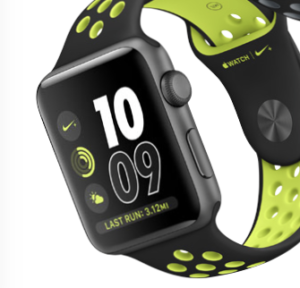
screen-shot-2016-11-01-at-5-58-46-pmReactions to the Apple Watch Nike+ version have been overwhelmingly positive as far as I can see. Here’s one review on Medium:
The accuracy is absolutely perfect, precise even. I’ve ran two 5K routes where I know exactly the half way point, and Nike+ was bang on. When I got back, it was instantly on my iPhone NRC App, with full route from first step to last. No gaps, nothing.

And one from TechCrunch:

What’s perhaps most interesting about Apple Watch Nike+ is that, at its heart, it’s just a regular, old Apple Watch. Those bright, perforated bands are removable by pressing a button on the back of the watch and sliding them out, sideways (not to mention the fact that there are more muted options than the yellow version I got). And if you buy the standard version of the Watch, you can always download and install the Nike app – though you’ll be missing the company’s custom faces with integrated Nike swoosh and some shortcuts.

Not real relevant for me since I always run with both my watch and my iPhone (until someone comes up with a plausible standalone podcast player for the watch). I’ve had big problems getting the watch and iPhone versions of various apps to talk to each other, which finally prompted me to switch from Runkeeper to RunTastic.

(I’d tried the Nike+ app, and at the time it only showed one piece of data on the screen at once, which was a deal breaker. The new version seems to fix that, tho it’d be hard to beat RunTastic’s customizable watch display.)

I personally think the black Nike+ band that is shown in all the product shots looks pretty good. Not sure how well the faces would work out, but it seems not an unreasonable idea to buy the Nike+ edition just to have the option–it can basically become a regular Sports watch anytime, and it’s the same price.

How does Apple Watch calculate active calories?

I found this article rather confusing and it sent me searching for a more straightforward explanation of how exactly the watch calculates how many calories you’re burning for the move ring in Activity. Here, from Reddit, is an explanation that is so straightforward as to be obvious:

Basically, you enter in your mass. The watch calculates about how active you are based on motion from the accelerometer and the heart rate meter. Then, using statistical models that they have generated from other people, they give you a calorie count.

That last sentence is odd. Where do the statistical models come from? Turns out Apple has a whole lab specifically dedicated to this.

Apple Watch feature request: a screen brightness sensor

The Apple Watch 2 has (1) a faster processor, (2) waterproofing, and (3) a much brighter display. The first is an unquestionable win. The first watch screams out for a faster processor. Even with watchOS 3 simple apps like Streaks are slow to launch and slow to react. The waterproofing seems less essential. The original watch is pretty well water resistant. However, I’ve found that swimming (and even showering) with it tends to trigger screen activations and taps, so it’s better to take it off for swimming anyway (though I wonder whether this was fixed on the new hardware?).

img_5867The brighter display seems totally unnecessary. I have my original Apple Watch screen on its dimmest setting, and I never have trouble seeing it, even in direct sunlight. In fact, the main problem I have with the display is when I accidentally trigger it at night: it’s too bright. Actually, the one feature I was most expecting from Apple Watch 2 was an ambient light sensor. This is what allows the screen on an iPhone to automatically adjust its brightness so it’s always readable but not blinding.
In day-to-day use, the constant screen brightness is one of the few things that keeps the watch from feeling completely natural and refined. Perhaps the next watch will have an ambient light sensor incorporated directly into the display.

In the patent, there are a few configurations through which Apple could execute the technology. One showcases the light sensors — which help the iPhone detect the ambient light in a room or outside — integrated directly above the touch-sensitive layer of the display (figure 6), while another has the sensor placed next to the touch-sensitive layer without intersecting it (figure 9).

App layout idea

img_5898The honeycomb app screen on the watch is not fantastically useful. It was one of the cool looking things in the original product demo, but in terms of usability, it’s a bit of a mess.
At the default size the icons are both too small to tap easily and too large to have enough of them visible on the screen, and the “blob” layout makes it difficult to navigate.

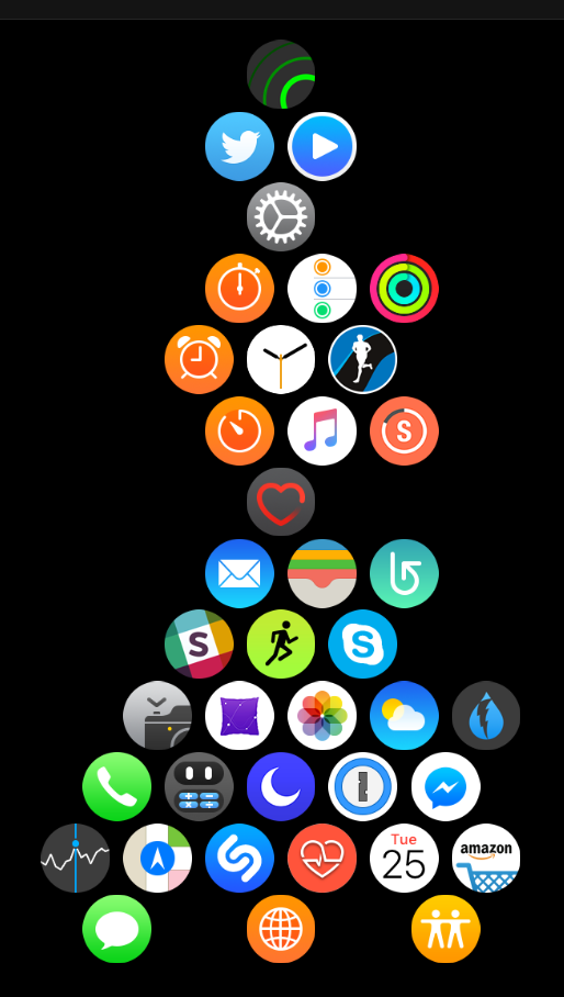
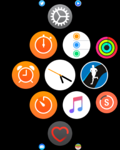
I’ve tried a few strategies for app organization, and here’s what works best for me. It’s sort of an hourglass shape. I group the apps that I actually access regularly from the app screen around the clock in a hexagon, withe a couple of extras hanging off the sides. This is what’s visible with I click into the screen. I place another frequently used app (the heart rate monitor) underneath, and I hang all the other, infrequently used, apps from the bottom of that.

They’re there if I want to img_5900go searching for them, but they don’t clutter my view. (I have a smaller clump hanging off the top — these are apps I’m considering incorporating into my regular workflow.) The key to having a useful app screen is to revisit frequently and adjust it based on what I’m actually using.
It’s not perfect, but it does make it easier to launch the apps I use frequently that aren’t in my complications or dock.

Still holding out hope that Apple revisits the app screen at some point. As boring as it would be, I think a scrolling 3 x 3 grid would be an improvement.

Notifications on Apple Watch stop working

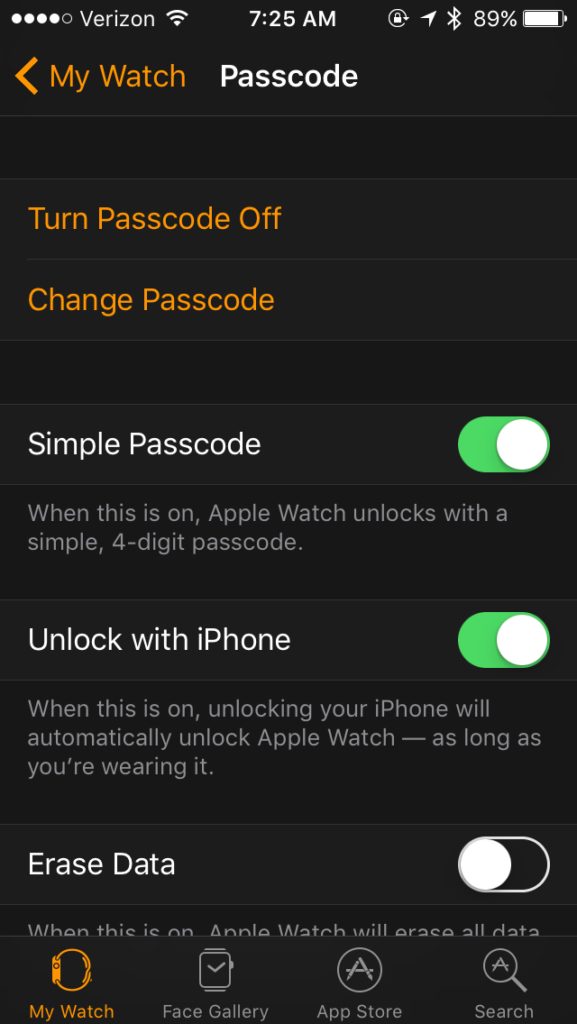
The other day I was messing around with my watch settings and I came across the setting to turn off passcode. If you have credit cards enabled in Apple Pay it will warn you that this setting will remove the cards from your watch. Disappointingly, no store I regularly shop at accepts Apple Pay, so this seemed worth trying out.

img_5865I turned it off and looked forward to putting my watch on the next morning without having to enter my 4-digit passcode. (I have the watch set to also unlock when I unlock my iPhone, but even that feels like a bit of a hurdle at 6 am.)

The next morning the watch sure enough was unlocked, but I soon felt something alarming: my pocket buzzing. Sure enough, my notifications were going to my iPhone, not the watch. Activity notifications showed up on the watch (they originate on the watch), but everything else was only on the phone, “No notifications” on the watch.

I hustled back over to the settings app and re-enabled passcode. I enabled a notification in Dark Sky for the next minute but nope–still on the phone. I Googled and tried every boneheaded suggestion I could find, but nothing made any difference. My favorite feature of the Apple watch was pooped.

This lasted for a full day and a half, until my iPhone again reminded me that update 10.0.2 was waiting for me. I installed the update and when the phone woke back up, the notifications were back to working on my watch. Huh? But also: hooray!

This fixes the problem for good—I can now turn off Passcode and notifications keep working, which is what I’m going with.