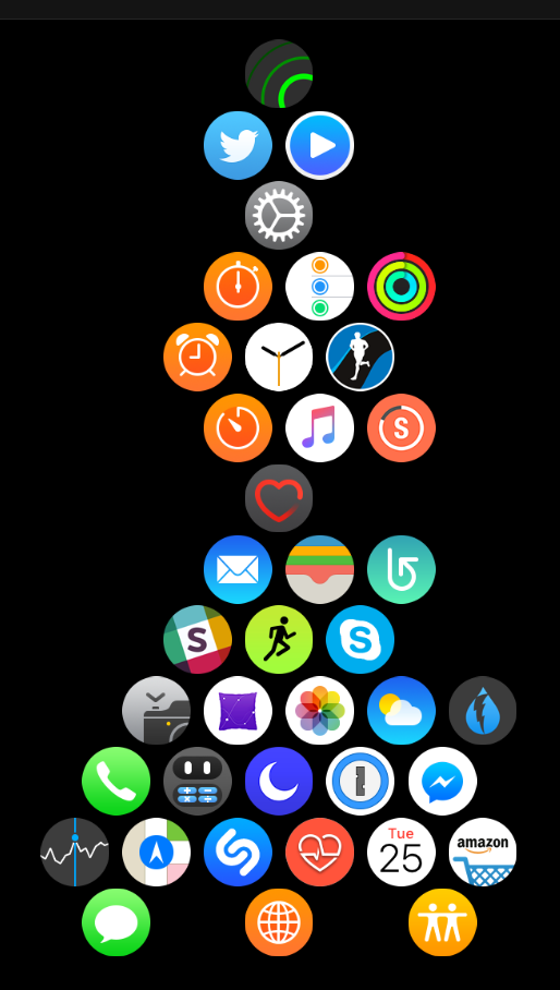
 The honeycomb app screen on the watch is not fantastically useful. It was one of the cool looking things in the original product demo, but in terms of usability, it’s a bit of a mess.
At the default size the icons are both too small to tap easily and too large to have enough of them visible on the screen, and the “blob” layout makes it difficult to navigate.
I’ve tried a few strategies for app organization, and here’s what works best for me. It’s sort of an hourglass shape. I group the apps that I actually access regularly from the app screen around the clock in a hexagon, withe a couple of extras hanging off the sides. This is what’s visible with I click into the screen. I place another frequently used app (the heart rate monitor) underneath, and I hang all the other, infrequently used, apps from the bottom of that.
They’re there if I want to  go searching for them, but they don’t clutter my view. (I have a smaller clump hanging off the top — these are apps I’m considering incorporating into my regular workflow.) The key to having a useful app screen is to revisit frequently and adjust it based on what I’m actually using.
It’s not perfect, but it does make it easier to launch the apps I use frequently that aren’t in my complications or dock.
Still holding out hope that Apple revisits the app screen at some point. As boring as it would be, I think a scrolling 3 x 3 grid would be an improvement.